Skinning Additional Winamp 2.9/5.x Windows
The Video Window

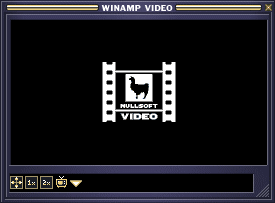
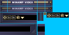
This file is for the Video window. It is resizeable and tiled, just like the playlist window. The titlebar occupies the two top rows. It's just like the playlist titlebar without the winshade mode and missing the winshade button. The close button is in the default state, beside the little graphic that is tiled across everytime the window is scaled horizontally.

video.bmp
The next row of graphics contains what would appear on the bottom left corner of the window which has all the video window buttons in their unpressed states. It also contains (from left to right) the left and right borders of the window for vertical scaling, the pressed close button and all the other buttons in their pressed state. The video buttons are (from left to right) full screen, regular size, double size, TV browser and load file. The next row of graphics has the right corner of the window and the bottom tile. The right corner has the resize button. The bottom tile will be used for horizontal scaling. Along this bottom tile, there will be a box to contain the current playing filename.
"Gen" Windows

gen.bmp
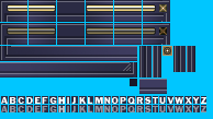
Gen.bmp is used for general purpose windows such as the media library and the AVS window in Winamp versions greater than 2.9. General purpose windows are resizeable and tiled. The first row is th active title bar and the second row is the inactive one. The title bar is divided into six parts. The first part is the top left corner of the window. The second is a fixed bitmap graphic which does not repeat in the title bar. The third section is the main title container. The fourth is another non repeating part of the title bar. The fifth section is used when the window is horizontally scaled. The last piece is the top right corner of the window and it contains the close window button. Below the title bars are the left bottom corner and the right bottom corner. The left one is placed above the right one. The right bottom corner has a resize button. To the right of these bottom corners are the sidewalls of the window. The left sidewall comes first then the right one. These sections are used during resizing. next to these is the close window button. next to this close button are the bottom corner sidewalls. These sections are used to join the sidewalls to the left and right bottom corners of the window. The left corner sidewall comes before the right one. The right one contains part of the resizer button from the bottom right corner of the window. Immediately below these corner sidewalls is a graphic for the bottom of the window. This graphic is tiled when the window is resized. Below this are the font of the titlebar. The highlighted one lies above the non highlighted font. The fonts are of variable width but not height. Both the highlighted and non highlighted fonts must be of the same width. The letters are ordered in the standard English alphabet order. There are no foreign characters.

genex.bmp
Genex.bmp is used for the buttons and sliders used in the general purpose windows. It also contains the colour controls for this window. The top button is the active state button. The one right below it is the inactive or pressed state button. These buttons have a four pixel wide border around it. The borders stay 4 pixels thick, no matter the size of the buttons or window. Beside these buttons is a row of pixels used to control the various colors and background of the gen window. The coordinates of the pixels are for as follows (y=0):
- x=48: item background (background to edits, listviews, etc.)
- x=50: item foreground (text colour of edits, listviews, etc.)
- x=52: window background (used to set the bg color for the dialog)
- x=54: button text colour
- x=56: window text colour
- x=58: colour of dividers and sunken borders
- x=60: selection colour for entries inside playlists (nothing else yet)
- x=62: listview header background colour
- x=64: listview header text colour
- x=66: listview header frame top and left colour
- x=68: listview header frame bottom and right colour
- x=70: listview header frame colour, when pressed
- x=72: listview header dead area colour
- x=74: scrollbar colour #1
- x=76: scrollbar colour #2
- x=78: pressed scrollbar colour #1
- x=80: pressed scrollbar colour #2
- x=82: scrollbar dead area colour
Below these are the scroll buttons. The first four buttons are these buttons: (from left to right) the scroll up unpressed, scroll down unpressed, scroll up pressed, scroll down pressed. Immediately below these are (from left to right) the scroll left unpressed, scroll right unpressed, scroll left pressed, scroll right pressed. Beside these two rows of scroll buttons are the sliders. The first one from the left is the vertical slider unpressed, the second one is the vertical slider pressed. Beside it, on the top is the horizontal slider unpressed. Below this is the horizontal slider pressed.
